Dyslexia Friendly Fonts: The Top 10 Fonts for Dyslexia
A dyslexia-friendly font is a font that is easy for people with dyslexia to read. Here are our top dyslexia-friendly fonts:
What are the best dyslexia fonts?
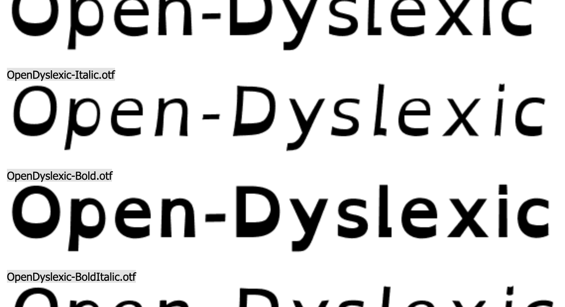
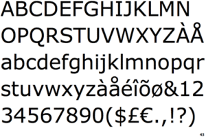
1. Open-Dyslexic
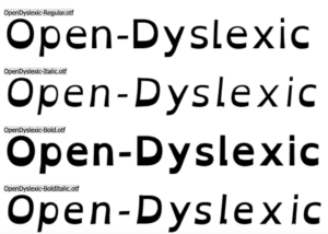
We have used this font in the thumbnail designs for our YouTube videos. This font was released in 2011. It is considered dyslexia-friendly because it is mostly sans-serif. Ablerado Gonzalez created this font in order “to help dyslexic readers.”
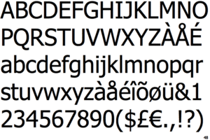
2. Arial
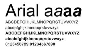
This is a very popular sans-serif font that is legible for dyslexics. Robin Nicholas and Patricia Saunders created the font for IBM in 1982. Our blog contributor April uses this font to type Microsoft Word documents because she thinks it is an easy font for those with dyslexia to read.
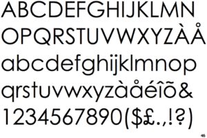
3. Comic Sans
Vincent Connare created this font in 1994. It was inspired by typefaces used for comics and graphic novels. While a lot of people have scorned at this font for being childish and unprofessional, it is still legible for people with dyslexia because as its name suggests. It has no serifs.
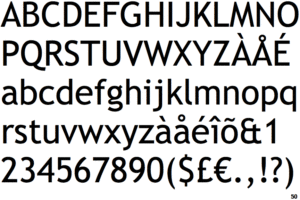
4. Verdana
Verdana was designed by Matthew Carter in 1994 and released by Microsoft in 1996. It was designed for legibility on computer, phone and tablet screens as well as legibility in printed form.
5. Tahoma
Matthew Carter also created the Tahoma font for Microsoft in 1995 and it was re-released in 2006. This font is similar in appearance to Verdana except that the letters appear taller. Tahoma was created. “to address the challenges of on-screen display, particularly in small sizes in dialogue boxes and menus.
6. Century Gothic
Century Gothic was designed in 1990 and it is influenced by geometric sans-serif styles from the 1920s and 1930s. Its rounded appearance in a few capital letters and most of its lowercase letters makes it “ideal for children’s books, school use, and language teaching.” Its sans-serif format makes it legible for dyslexics.
7. Trebuchet (AKA Trebuchet MS)
Vincent Connare designed the Trebuchet font in 1996. It is “a humanist sans-serif font” that was “designed for easy screen readability” and it is also inspired by sans-serif fonts from the 1930s.
8. Calibri
This font was released in 2007 as a Microsoft 365 (formerly called Office 365) default font in Word, Excel and Powerpoint. It has a similar appearance to Trebuchet, particularly the lowercase G. It was also designed for legibility on computer, phone and tablet screens.
9. Open Sans
Open Sans is another humanist Sans-Serif font that Steve Matteson developed between 2010 and 2011. It resembles the Trebuchet and Calibri fonts.
10. Helvetica
This is the oldest font in this list because it was designed in 1957. Max Miedinger and Eduard Hoffmann designed it at the Haas Foundry in Munchenstein, Switzerland. It was originally named Neue Haas Grotesk, but the German Stempel foundry renamed it Helvetica in 1961 when they produced different versions of it.
If you think you have traits of dyslexia, take our free dyslexic test to find out if you have neurodivergent traits.
Blog Author

April Slocombe


